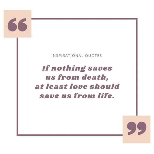
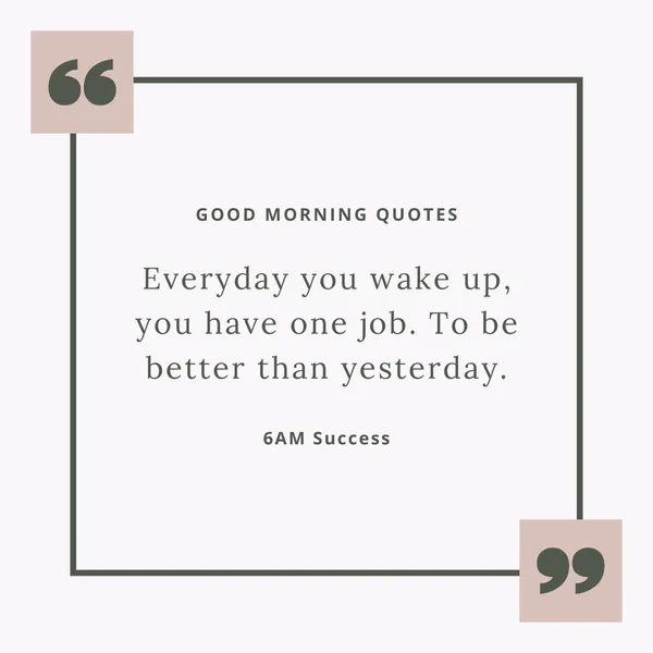
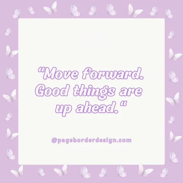
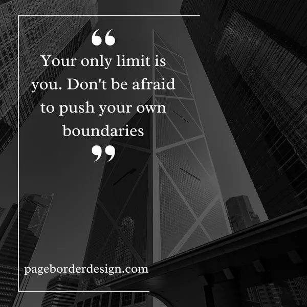
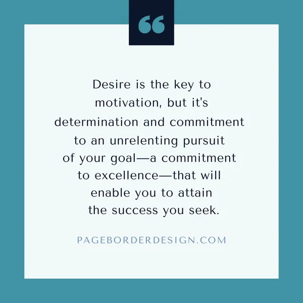
Do you know there is always an exciting border around such items as pictures or posters while the inner surface bears a motivational message? These Internet ideas are called quote borders, and it’s nice that words can also look like pictures.
A quote border simply puts a favorite saying or quote in a frame. It’s not just a plain line; it’s a design that makes the words look even better. In this article, we will learn how to design cool quote borders. We will discuss how to design them, what type of fonts to incorporate and how to make these look professional. Prepare yourselves for the tutorial on creating your encouraging quote borders.
Design Approaches
We only get to decide the appearance inside the border, which dictates how the quote appears. Here are a few creative ways to do it:
1. Simple Elegance
What it is: This style is clear and stylish at the same time. It is about reducing the emphasis on the quote by having a minimal and not excessively large border around it.
How to do it:
- Borders: Don’t overcrowd (One or two thin lines are enough), use very light patterns (dots or a very faint watermark), or even just a simple switch of background colour.
- Fonts: The applied font should be a classic serif (for example, Times New Roman, Garamond, Georgia) or a simple and clean sans serif (for example, Arial, Helvetica, Calibri) of regular or italic.
- Layout: It is a common practice to place the quote right in the middle of the borderline.
- Color Palette: Basically, dark on light works best, or vice versa, so for example, instead of solid black type on a white background, one could have different shades of black.
See it in action:
- Suppose you picture a narrow line, actually black, located in the centre of a plain white sheet. The quote is in Garamond font, in the middle of the page, and in this dark grey colour.
- Imagine that the following design is an ultra-light beige colour that surrounds a slightly darker shade of beige (just a change of the background in the frame). These include the following: The quote on the poster is in a simple Calibri font type and brown colour, dark.
- For example, black and thick writing looks like two thin parallel lines, one on the other, especially in deep blue and written over a lighter blue. The attached quote is written in typical serif, like Georgia, in the same deep blue colour.
2. Decorative Flourishes
What it is: This style has many elements; everything smells and looks like celebrities. It’s appropriate for comments that seem like they came from the Stone Age or for romantic or playful quotes.
How to do it:
- Borders: Employ different fancy picture frames with decoration of swirls, flowers or other such classical designs. These can be photos downloaded online or sketches you draw by hand.
- Fonts: That is why script fonts (like Brush Script or Allura), fancy serif fonts (like Playfair Display), or even old-style blackletter fonts will work great.
- Embellishments: Flags, ribbons, banners, small drawings, and watercolour paint can be used to make it even fancier.
- Colour Palette: So use lots of different colours; you use shiny metallic colours such as gold or silver.
See it in action:
- The idea is a border with the vine and the leaves entwined around. The quote is in cursive, like Allura font, and it is in dark green. The quote is in the centre of the page with several small flowers drawn by hand on the sides.
- Now imagine this frame is old, and the corners are gasped with beautiful accuracy. Engro is in cursive in a dark brown colour, and the quote is in a fancy serif font like Playfair Display. The background resembles old paper.
- It’s like having a drawing of a border with pastel hues that have been drawn using watercolours. The quote is done cursing live, just slightly liker than one of the pastel shades.
3. Modern Minimalism
What it is: This style is clear, with straight, solid lines and blunt and straightforward, punchy forms of writing. Quotes that are strong, direct, or seem very new are mainly well-served.
How to do it:
- Borders: The patterns should be thin lines, geometric shapes such as rectangles, squares, circles, or unsophisticated patterns only. There are cases when there is no border at all – only some colour or structure in the background.
- Fonts: Choose to write characters emphatically, using heavy fonts such as the Helvetica, Arial Black and the Impact font or fonts that resemble shapes such as the Futura font.
- Layout: If you place words on the left or right side or divide the quote into lines, you will see which words are stressed.
- Colour Palette: simple colours, for example, black & white or bright colours on a simple background.
See it in action:
- Some fancy people seem to think combining two words will magically create a third word – for example, having a thick black bar at the top and the bottom of the quote. The quote is in a large font, similar to Impact, white on black.
- In other words, let’s imagine ourselves first having a light grey rectangle as the primary context. Here is a quote in a big text like ‘Helvetica” It is written in dark grey on the left side.
- The quote is divided into three lines, with the size of the same bold type of words: some are more prominent. The layout of the entity has a plain background as it is coloured with just one plain colour.
4. Handwritten Charm
What it is: This style is about looking personal, informal and REAL. It is excellent for quotes about emotions, ideas, or occurrences.
How to do it:
- Borders: Try to make the shapes, either just lines or jagged-edged lines to mimic ripped paper or fabric or natural items like twigs or leaves with jagged edges. In other cases, there can be no line but a rough, grainy area towards the following image.
- Fonts: The best fonts to use are cursive ones (like Permanent Marker or Amatic SC) or even cursive handwritten ones if the writer’s handwriting is legible and can be scanned.
- Embellishments: Making small changes, such as using transportable communication doodle illustrations or watercolour splatters to make it look more handwritten.
- Colour Palette: Choose earthy colours, such as beige, brown, green or other light pastel colours.
See it in action:
- Suppose there was a quote like this in cursive style, like SC, in dark brown, with a background of a lined-paper effect. Besides the quote, there is a line drawing of a coffee cup.
- Imagine a quote left in black font in someone’s screenplay on the background that resembles the texture of the paper you draw on. Intersecting lines appear like paper that has been cut roughly.
- Just imagine the text of a quote typed in a handwritten font, and the background colour was light blue with a watercolour texture in the pastel range.
Font Choices
The selection of proper fonts to use on your quote border is crucial. Here are some things to think about:
- Easy to Read: Choose appropriate fonts, especially for the words written in small and faint fonts. Avoid using decorative fonts or those that appear as illustrations of written language.
- Matching the Feeling: You should select the fonts that will reflect how the quote affects you. For instance, a strong and bold font is desirable if the subject of discussion is a powerful quote. This would be appropriate for a love quote – a pretty, flowing font.
- ColColoursat Stand Out: Be sure that the colour of the ters differs from the background colour. This makes it easier to read.
Design Aesthetic Borders
Here are some tips to make your quote borders look great:
- Don’t Put Too Much Stuff: Adding so much of it into the particular area bordering one another is unnecessary. Do not superimpose the quote, as leave some room around it so that it can be easily seen.
- Use Colors That Match: Choose the colours suitable for the feeling of your quote. For the happy quotes, make them yellow and orange; for the thoughtful quotes, make them blue and green.
- Add Interesting Textures: Borders look even better if you can use backgrounds or borders with a texture. The more complex the pattern you choose, the better it will work; use patterned paper, fabric or just pictures of such objects as wood or stone.
- Change the Size and Place: You can enlarge or decrease the size of some words and use them in the border in the most enjoyable way possible.
- Make it Fit the Project: Ensure that your quote border is nice, depending on what you are using for a poster, card, or email post online.
Finding Inspirational Quotes
Here are some places to find good quotes:
- Read Old Books: The named persons are well-known authors, poets, and thinkers; read quotes about books from them. Reading books, either Roald Dahl or J.K Rowling, will help you find good quotes.
- Listen to Music: Lyric to many songs contain positive expressions and suitable moral lessons.
- Look at Nature: It is good to have quotes by famous people such as Dale Carnegie noting nature, growing, and being strong, assertive male individuals.
- Think About Your Life: Take time and consider events that may have occurred to you, and then write down any quotes that you have read or heard that have some meaning to you.
Quote Border Design
Beyond Borders: Expanding the Concept
You can use quotes in other ways besides just borders:
- Quote Posters: Create post-topical posters with extensive, bold origination quotes. These can be very good to put on one’s bedroom walls or in a classroom.
- Motivational Wall Art: Create graphic design art with motivational sayings for your house or workplace. This can add positivity to a room.
- Personalised Gifts: For special occasions, such as birthdays or card-giving season, people should also have framed quotes or cards which they can share. These are great for showing someone that you care.
- Digital Art: Post prompted pictures with quotes on social media. This is a good way to inspire several people, as most spend their time online.
In conclusion, The quotes and the borders can be beautiful and powerful when you choose good quotations and design good borders.
